A Big Picture Look at Greenhouse Gas (GHG) Emissions
The combined disciplines of graphic arts and data modeling have provided some amazing new ways of visualizing the intricate details of how our society, country and planet function.

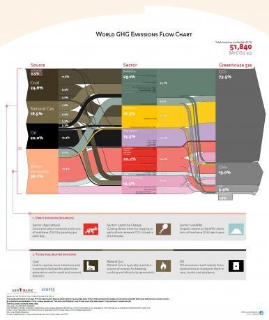
The combined disciplines of graphic arts and data modeling have provided some amazing new ways of visualizing the intricate details of how our society, country and planet function. Case in point: this flowchart from Ecofys, an international energy and climate consultancy, which displays the major generators of greenhouse gas (GHG) emissions, organized by source, sector and broken down by end use or activity. It is, in effect, a whole-Earth inventory of anthropogenic GHG sources.
This visual catalog of the major contributors to air pollution provides a way of reexamining previously understood notions about the main producers of GHG emissions. It has the potential to alter perspectives about the climate-changing roles played by various links in the supply chain.
For example, consider the emissions of how much we travel and the energy use of our buildings compared to the consumption and disposal of goods. Taken together, emissions from Industry, Landfills, Agriculture, Forestry and Other Land Use represent 50.9% of total emissions, compared to those from Buildings and Transport, which represent 32.8% of overall global emissions. To the developed world – especially those of us who deal with commuter traffic and home energy bills regularly – the impacts of where we live and work, and how we travel may seem far more tangible an impact than the effects of what we consume. Yet the net emissions of the production and disposal of goods is nearly double that of transport and buildings. Clearly, if consumers are mindful and learn to reduce and reuse, we could significantly lower our impacts.
Visuals like the chart provide the opportunity to consider the larger, complex picture of human activity on our planet, and allow us to step back and re-frame our understanding of the situation so that we can examine the hotspots that deserve priority and observe whether progress is being made.
If you’re curious about comparing the GHG impacts of different activities, another great resource is the EPA’s greenhouse gas equivalencies calculator. (https://www.epa.gov/energy/greenhouse-gas-equivalencies-calculator)